
Sun Apr 06 - Written by: Ruth
9 Color Palettes Inspired by Italian Living Rooms
Discover stunning color combinations drawn from Italy's most beautiful living spaces, from Tuscan warmth to Venetian opulence. Learn how to implement these timeless Italian color palettes in your own home.
Looking to bring some Italian flair into your living room? There’s something magical about the way Italian homes blend warm colors and timeless style. From sun-baked Tuscan villas to modern Milan apartments, Italian living spaces have a way of feeling both cozy and sophisticated at the same time.
Embracing Tuscan Warmth: Terracotta, Olive, and Cream
Take a trip to the sun-soaked hills of Tuscany right in your living room with this timeless color combo that brings the Italian countryside home.
 A warm Tuscan-inspired living room with terra cotta floors and olive green accents creates an inviting atmosphere. Source: AweDeco
Mediterranean Earth Tones
Picture walking into a rustic Tuscan villa where terracotta tiles meet olive-painted walls. This classic trio starts with a deep, rich terracotta that feels like sun-baked clay (Sherwin-Williams SW 7587). You’ll want to use this warming shade on statement walls or through decorative pieces like vases and throw pillows.
The olive green (Benjamin Moore HC-113) works as your middle tone, showing up in soft furnishings like curtains or an accent chair. It’s that perfect shade you’d spot in Italian olive groves. Think of it as nature’s neutral not too dark, not too light.
Cream (Farrow & Ball ‘White Tie’) ties everything together as your light neutral. It’s softer than stark white and has just enough warmth to feel cozy, not clinical. You’ll see it on crown molding trim baseboards and ceiling details.
Mix these colors in a 30-40-30 split:
- 40% cream for walls and ceilings
- 30% olive for furniture and fabrics
- 30% terracotta for accents and architectural details
Natural Light Integration
Italian homes know how to work with sunlight and these colors show off best in natural light. Set up your seating near windows where morning sun can play off those terracotta accents. The olive tones look amazing when late afternoon light hits them.
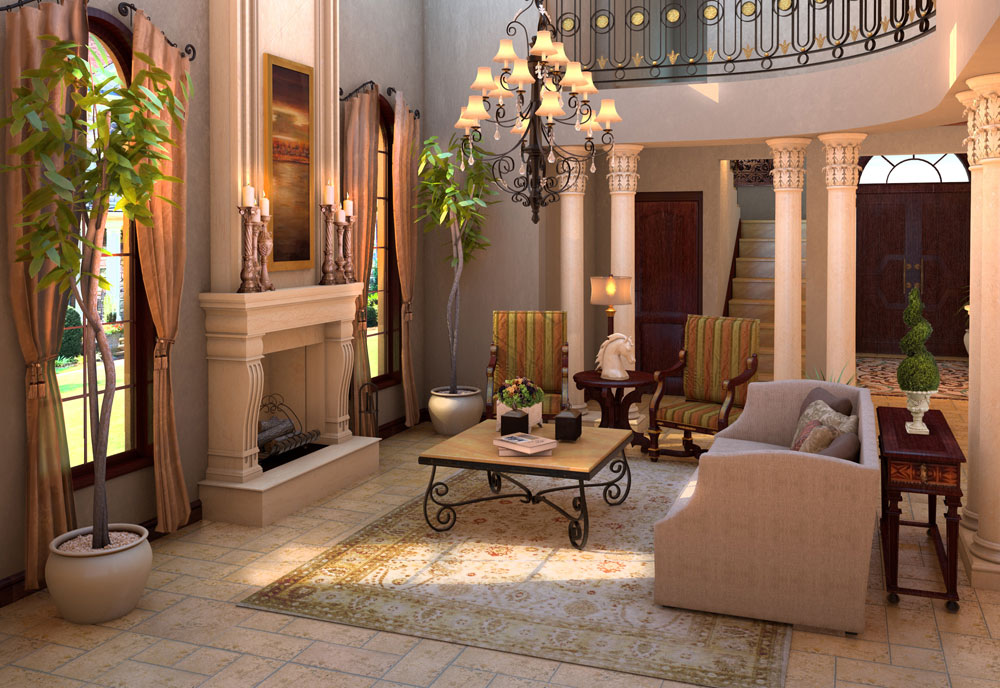
 Spacious Tuscan-inspired interior featuring earthy tones, stone fireplace, and vintage accessories that capture the essence of Mediterranean living. Source: Edward George
Your cream walls will change throughout the day warmer in morning light cooler in the evening. That’s exactly what you want! Leave your windows uncovered or use sheer white curtains to let that Mediterranean-style light flow in.
Pro tip: Place mirrors across from windows to bounce light around the room. A large mirror with an antiqued gold frame adds that extra touch of Italian elegance while making your space feel bigger and brighter.
Position reading nooks or conversation areas where natural light hits them directly. You’ll get that cozy Italian living room feeling where family gatherings stretch from sunny afternoons into golden evenings.
Classic Roman Elegance: Gold, Burgundy, and Ivory
Draw inspiration from Rome’s lavish palazzos with this rich color scheme that brings old-world glamour home.
Traditional living room featuring rich burgundy walls and gold accents creates timeless Roman elegance. Source: Houzz
Regal Color Combinations
Picture walking into a room where deep burgundy walls meet gleaming gold accents and soft ivory details. This combo screams luxury without trying too hard! Start with burgundy as your main color – it works great on an accent wall or plush velvet sofa. You’ll want to use this bold shade for about 40% of your space.
Gold comes next, but don’t go overboard. Think small touches like picture frames, mirror edges or light fixtures. It’s perfect for about 25% of your décor choices. The trick is using both matte and shiny gold finishes to keep things interesting.
Balance it all out with ivory for the remaining 35%. You can add ivory through:
- Marble-look coffee tables
- Textured throw pillows
- Cream-colored curtains
- Light upholstery
- Painted trim work
 Opulent burgundy and gold luxury baroque living room exemplifies classic Roman elegance. Source: Pinterest
Timeless Accents
Let’s talk about the fun stuff – the details that make this palette pop! Start with classic Roman patterns like Greek key borders or laurel wreaths in gold. They look amazing on ivory throw pillows or as wall trim.
Here’s what you’ll want to grab:
- Bronze or brass table lamps
- Deep red vintage-style rugs
- Ivory silk curtains with gold tassels
- Burgundy velvet accent chairs
- Gold-framed mirrors
Mix up your textures too. Try pairing:
- Smooth marble surfaces
- Plush velvet fabrics
- Glossy metallic finishes
- Matte painted walls
- Woven textiles
Don’t forget about art! Black and white photos in gold frames look stunning against burgundy walls. Or try classical artwork prints – they’re perfect for this style and often feature all three colors naturally.
Coastal Amalfi Vibes: Azure, White, and Sand
Picture yourself in a sun-drenched living room overlooking the Mediterranean, where cool sea breezes meet classic Italian style.
 A bright coastal living room with azure blue accents, white walls, and sandy beige tones creates a serene Mediterranean atmosphere. Source: Salt Water Vacations
Seaside-Inspired Elements
Your color split should be 40% azure blue (like the deep Mediterranean waters), 35% crisp white (like seafoam), and 25% warm sand tones. Paint your walls white to create a bright base, then bring in azure through comfy oversized sofas or statement curtains.
You’ll want to add sandy beige through natural fiber rugs and woven baskets. Try these easy touches:
- White-washed wooden furniture with curved lines
- Azure blue throw pillows with white piping
- Sandy-colored jute or sisal area rugs
- Ceramic vases in varied blue shades
- White linen curtains that catch the breeze
- Coastal artwork featuring Mediterranean scenes
The key is keeping things breezy and light. Skip heavy fabrics and dark woods – you’re going for that carefree coastal feel.
 Amalficore decor inspiration board showcasing the perfect blend of azure blue, white, and sandy neutral tones. Source: SampleBoard
Natural Material Pairings
Your Amalfi-inspired space needs materials that feel like they belong by the sea:
Raw Materials to Include:
- Whitewashed wood for coffee tables and shelving
- Natural rope details on chairs or lighting
- Textured limestone or travertine flooring
- Handwoven rattan or wicker accent pieces
- Light linen upholstery that’s cool to touch
- Glazed ceramic tiles in watery blue patterns
Mix your textures but keep them subtle. Pair smooth surfaces (like polished stone) with rougher ones (like woven chairs). Think about how these materials feel in a beach house – cool, casual and unfussy.
For your accent pieces, stick to:
- Clear glass vases filled with white flowers
- Pale wooden picture frames
- Natural fiber baskets for storage
- Blue and white ceramic bowls
- Rope-wrapped glass hurricanes
- Shell or coral decorative objects
Remember to keep metal finishes light – brushed nickel or chrome works better than gold or bronze in this seaside scheme.
Venetian Opulence: Deep Blue, Ruby, and Pearl
Take a page from Venice’s grand palazzos with this dramatic color combo that mirrors the city’s romantic waterways and royal heritage.
 A vibrant living room showcasing jewel tones with deep blue walls, ruby accents, and pearl-toned finishing touches. Source: Village Blinds and Shutters
Rich Jewel Tones
Deep blue should cover about 45% of your space through statement walls or plush velvet sofas. It’s the perfect backdrop for ruby accents, which work best at 30% – think throw pillows decked in rich damask patterns or heavy drapes that pool elegantly on the floor. Pearl-toned elements (25%) break up these intense colors and add a touch of sophistication.
You’ll get the best results by layering these colors:
- Paint your largest wall in midnight blue
- Pick a ruby-colored Persian-style rug as your anchor piece
- Add pearl-white trim and moldings for classic Venetian flair
- Mix in ruby velvet cushions against blue upholstery
- Use pearl-toned lampshades to soften the rich colors
Go for fabrics with subtle sheen – silk brocades and velvets work great for that authentic Venetian look. Pattern mixing is key here: pair geometric designs with flowing florals in your chosen jewel tones.
 Traditional sitting room featuring jewel tones with rich draperies and elegant furniture pieces exemplifies the Venetian opulence aesthetic. Source: Village Blinds and Shutters
Metallic Highlights
Venetian style’s all about that sparkle, so don’t hold back on metallic touches. Your best bet is using:
- Antique gold mirror frames (they look amazing against deep blue walls)
- Silver-leafed side tables that catch light
- Bronze light fixtures with crystal details
- Copper-toned picture frames for family photos
- Pearl-finished ceramic vases
Keep your metallic mix at about 15% of your overall design – just enough to catch the eye without going overboard. Place your shiny pieces where natural light hits them for that classic Venetian shimmer.
Pro tip: stick to vintage-style metals with a patina rather than super-shiny new pieces. They’ll give you that lived-in palazzo feel that’s so uniquely Venetian. Mix warm and cool metallics freely – it’s totally fine to put gold next to silver in this style.
Florentine Renaissance: Sage, Rust, and Beige
This timeless color palette brings the artistic spirit of Florence’s golden age right into your living room.
 A perfectly balanced palette of sage green, rust tones and beige creates a Renaissance-inspired living space. Source: Pinterest
Historical Color Harmony
You’ll find sage green taking center stage in many Florentine homes, making up about 35% of the color scheme. It’s the same gentle green you’d spot in Renaissance frescoes or the rolling Tuscan hills. Pair it with warm rust tones (40%) on your larger furniture pieces like sofas or armchairs to create that classic Italian feel.
The remaining 25% should be beige, which works as your neutral backdrop. Think of the weathered stones of Florence’s Duomo – that’s the exact shade you’re after. Try painting your walls in a soft beige and add sage green curtains with rust-colored throw pillows.
Here’s a quick breakdown of your color distribution:
| Color | Percentage | Best Used For |
|---|---|---|
| Rust | 40% | Main furniture, accent walls |
| Sage | 35% | Curtains, plants, accessories |
| Beige | 25% | Walls, trim work |
.jpg) Renaissance-style living room featuring a harmonious blend of historical colors and classical architectural elements. Source: Luxury Italian Furniture
Renaissance-style living room featuring a harmonious blend of historical colors and classical architectural elements. Source: Luxury Italian Furniture
Traditional Pattern Integration
Start with geometrical patterns that mirror Florence’s famous marble floors. You’ll want to pick out rugs or throw pillows with diamond shapes or interlocking circles in your rust and sage colors. These patterns work great as accent pieces without overwhelming your space.
Mix in some damask prints on your curtains or upholstery – they’re a Florentine classic. Keep them in two colors max (like sage on beige) to avoid making the room feel busy. Try using these patterns on:
- Decorative cushions with geometric designs
- Area rugs featuring traditional Florentine motifs
- Wall tapestries in muted sage and rust tones
- Upholstered chairs with subtle damask prints
Don’t forget about texture – use raw silk or linen fabrics to add depth to your pattern play. A textured beige wallpaper can bring subtle movement to your walls while keeping them neutral. Remember to space out your patterns – if you’ve got a bold geometric rug, keep your nearby furniture pieces solid-colored.
Modern Milan: Charcoal, Blush, and Silver
Think sleek Italian fashion meets cozy home vibes. This palette brings Milan’s cutting-edge design straight to your living room with a perfect 40-30-30 split of charcoal gray base tones complemented by soft blush and metallic silver accents.
 A contemporary living space featuring the sophisticated combination of charcoal gray with soft blush pink accents. Source: Decoholic
Contemporary Urban Elements
Your walls will pop in a sophisticated charcoal gray that’s both bold and versatile. Paint your largest wall in this deep tone and watch how it makes your furniture stand out. A plush sectional in light gray creates the perfect contrast while keeping things modern.
For that Milan runway feel, add blush pink through:
- An oversized abstract canvas above your sofa
- Two or three throw pillows in different pink shades
- A modern area rug with subtle pink undertones
Silver touches bring in that urban edge through:
- Chrome-finished floor lamps
- Sleek metal coffee table frames
- Mirror-polished decorative objects
Mix up your textures with:
- Matte charcoal walls
- Smooth velvet upholstery
- Polished metal surfaces
- Textured throw blankets
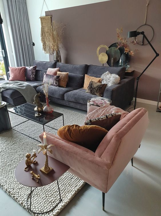 Elegant blend of grey and blush pink with metallic accents creates a sophisticated Milan-inspired living room. Source: Decoholic
Minimalist Accents
Keep your decor clean and purposeful – that’s the Milan way. Stick to these simple rules:
Statement pieces that matter:
- One large mirror with a slim silver frame
- A single striking art piece
- Two matching table lamps with metal bases
Smart storage solutions:
- Floating shelves in charcoal
- Hidden storage ottomans in blush
- Clear glass or acrylic side tables
Layer your lighting with:
- Recessed ceiling spots
- A modern pendant light
- Strategic task lighting
Pro tip: Don’t overdo it with accessories. Pick 3-5 key pieces per surface and keep them in your color scheme. Think a silver bowl, a blush vase and a few art books with gray spines grouped on your coffee table.
The magic’s in the empty space between objects. Leave room for your eyes to rest – just like those gorgeous Milan boutique windows you’ve seen in magazines.
Sicilian Sunset: Orange, Yellow, and Brown
Draw inspiration from Sicily’s sun-drenched landscapes with this warm and inviting color scheme that brings Mediterranean charm into your living space.
 Warm sunset color palette inspiration with orange, yellow, and rich brown tones that evoke the Sicilian landscape. Source: LoveToKnow
Warm Desert Influences
Picture the golden hour in Sicily – that’s what you’ll get with this color mix. Go for burnt orange as your main color (40%) on larger pieces like sofas or accent walls. Add sunny yellow touches (35%) through throw pillows scatter cushions or wall art. Round it out with rich brown details (25%) in wooden furniture or decorative items.
For the walls try a warm sand color that’ll make your space feel cozy but not cramped. Pick out curtains in a sheer golden yellow to let that natural light pour in just right. Large terracotta pots with Mediterranean plants like olive trees or rosemary can bring life to empty corners.
Your lighting choices matter too. Swap out cool white bulbs for warm ones that’ll make those oranges and yellows really pop. Wall sconces with amber glass shades work great for creating that perfect sunset glow any time of day.
 Living room featuring warm orange and rich brown tones that create the warm, inviting atmosphere characteristic of Sicilian design. Source: Laurel Bern Interiors
Rustic Textures
Let’s talk about making this color scheme feel authentic. Start with rough-hewn wooden beams or furniture – the more natural looking the better. A distressed leather armchair in cognac brown can be your statement piece.
Mix in some woven elements like jute rugs or rattan accent chairs. They’ll add visual interest without overwhelming your space. Handmade ceramic pieces in orange and yellow glazes make perfect coffee table accessories or wall decorations.
Don’t forget about fabrics! Layer different textures like nubby linen throws chunky knit pillows and smooth velvet upholstery. Pick patterns that feel local – think simple geometric designs or traditional Sicilian motifs in your chosen colors. A textured orange throw on a brown leather sofa creates that perfect lived-in vibe you’re after.
Lake Como Serenity: Seafoam, Gray, and White
Take your cues from Italy’s most glamorous lake with this relaxing color combo that brings the outside in. You’ll want to split these shades 35-35-30 between seafoam green walls soft gray furniture and crisp white accents.
 Living room with colors influenced by water elements - seafoam green, soft gray and bright white - creating a serene Lake Como atmosphere. Source: Edward George
Tranquil Water Elements
You’ll feel like you’re floating on Lake Como’s peaceful waters with seafoam green as your main color. Paint your walls this soothing shade or bring it in through large-scale art prints of rippling water. Try laying down a seafoam area rug with wave-like patterns to create movement in your space.
For the perfect lakeside vibe mix in frosted glass vases chrome light fixtures and mirrors with wavy frames. These reflective surfaces catch light just like sunlight dancing on water. Add glass coffee tables or side tables with curved edges to keep the fluid feeling going.
Your curtains can play a big part too. Pick sheer white panels that’ll flutter in the breeze or go for seafoam-tinted organza that filters light like lake water. Keep the look fresh by spacing out your water-inspired pieces rather than clustering them together.
 Chic coastal living room featuring seafoam green, white, and gray tones that create a tranquil Lake Como-inspired atmosphere. Source: Pinterest
Natural Stone Inspiration
The gray in this palette comes straight from Lake Como’s surrounding mountains and stone villas. Pick out a plush gray sofa in a textured fabric that feels like smooth river rocks. Match it with stone-look side tables or a concrete-finish coffee table.
Work in some white marble accents through lamp bases table tops or decorative objects. These pieces will pop against the softer grays and seafoam shades. Think about adding a feature wall with gray stone-effect wallpaper or textured paint.
Don’t forget smaller touches like gray ceramic vases chunky stone bookends and white pottery pieces. Stack a few gray throw pillows in different textures on your sofa think nubby wool smooth velvet and natural linen. Keep the overall feel light by mixing your grays with plenty of white space.
Umbrian Countryside: Ochre, Forest Green, and Taupe
Rural Color Heritage
The earthy colors of Umbria’s countryside come straight from its rolling hills and ancient stone houses. You’ll spot these warm shades everywhere in traditional Umbrian living rooms, with ochre making up 40% of the space through textured walls and large furniture pieces. Forest green takes 35% of the room in upholstered chairs and rich curtains while taupe fills the remaining 25% in natural stone floors and weathered wooden beams.
 A rich forest green sofa anchors this living room, complemented by taupe walls and ochre accents reminiscent of the Umbrian countryside. Source: Maker&Son
Here’s how these colors work in real numbers:
| Color | Percentage | Main Uses |
|---|---|---|
| Ochre | 40% | Walls, large furniture |
| Forest Green | 35% | Upholstery, curtains |
| Taupe | 25% | Flooring, accents |
Paint your walls in a warm ochre shade that reminds you of sun-baked wheat fields. Try forest green velvet on your sofa or armchairs – it’s both cozy and sophisticated. Mix in taupe through natural stone tiles or aged wooden furniture for that lived-in farmhouse feel.
 A beautifully balanced living space featuring forest green and taupe tones that channel the natural beauty of the Umbrian landscape. Source: Pinterest
Pastoral Influences
You’ll want to take cues from Umbria’s famous olive groves and vineyards when picking out your decor. Start with thick-woven textiles in forest green for your throw pillows and curtains. These colors work best in rooms that get lots of natural light – the sun brings out the richness in each shade.
Layer different textures to create interest: rough stone walls in taupe pair perfectly with smooth ochre plaster. Add some rustic touches like wrought iron light fixtures or terra cotta pots filled with herbs. Keep your furniture sturdy and simple – think solid wood tables with a natural finish and comfy chairs with green cushions.
Don’t forget about pattern play. Mix in some traditional Umbrian textile patterns in small doses – maybe a striped ochre cushion or a geometric green throw. Your room should feel warm and lived-in, just like those cozy Italian farmhouses that have stood for centuries.
Creating Your Perfect Italian-Inspired Color Palette
 Sun-drenched Italian country room showcasing rustic elements, earth tones, and Renaissance-inspired decor - perfect inspiration for creating your own Italian color palette. Source: Edward George
Pick Your Main Color First
Start with one strong shade you love – maybe it’s Tuscan red or Amalfi blue. This’ll be about 40% of your room’s color and set the mood for everything else.
Add Two Supporting Colors
Choose one color that’ll take up 35% of the space and another for the remaining 25%. If you went with Tuscan red, try cream (35%) and olive green (25%) to round things out.
Test Your Colors in Different Lights
Put paint samples on your walls and check them during morning, afternoon and evening. Italian homes get lots of sunlight, so you’ll want colors that look good all day long.
Start Small
Try your palette on one wall or with some throw pillows first. It’s way easier to swap out cushions than repaint your whole room if you change your mind.
Match Your Style
Think about which Italian region speaks to you – modern Milan needs different colors than rustic Tuscany. Let that guide your picks.
| Color Type | Percentage | Where to Use |
|---|---|---|
| Main Color | 40% | Walls or large furniture |
| Second Color | 35% | Accent walls or curtains |
| Third Color | 25% | Accessories and decor |